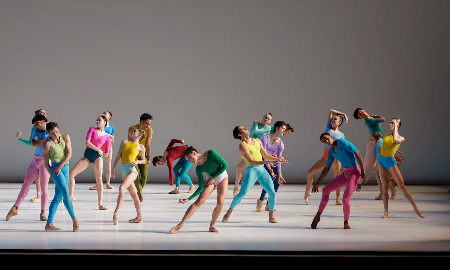
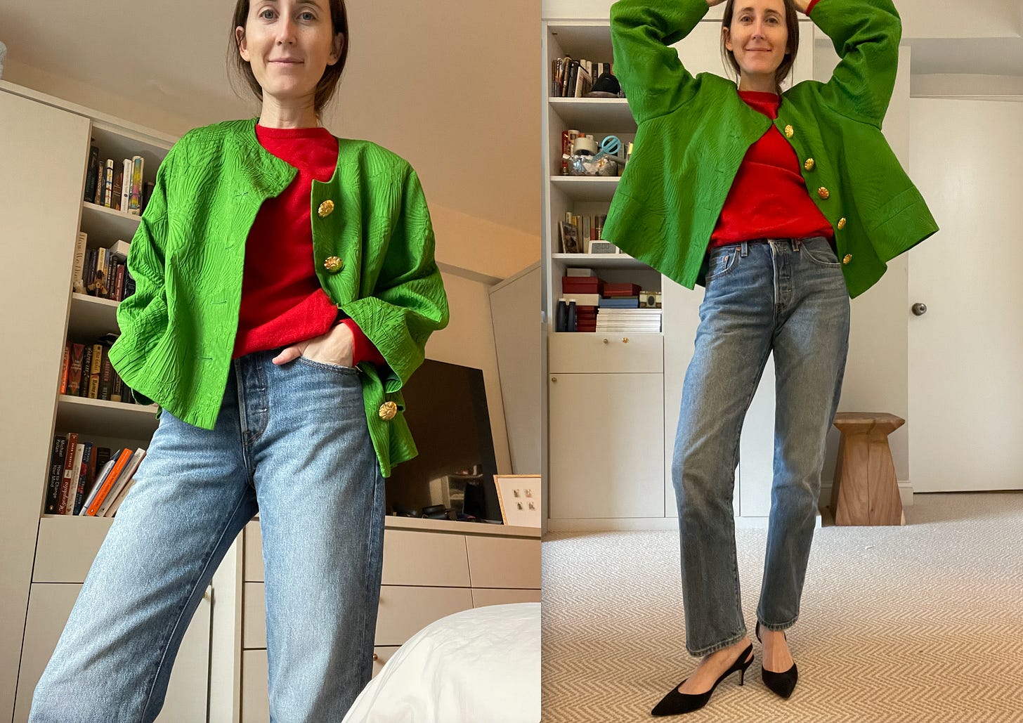
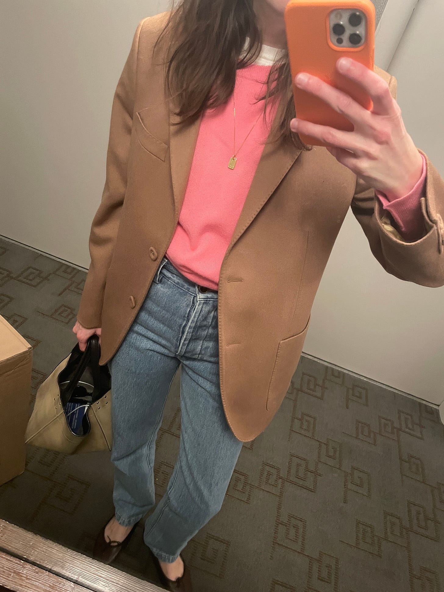
I started writing this post a month ago. I kept trying to get dressed and never felt complete without my red sweater. And THEN I saw the new Copland Dance Episodes at New York City Ballet. Once I saw those crazy color combinations, I started noticing them everywhere. Literally, a woman biked passed me this morning in a neon yellow taped bike, a blue parka and purple helmet and I thought, WOW those colors are GREAT together! But each time I tried to write this, I realized, its almost IMPOSSIBLE to dictate why some colors work and others just…don’t?

And then last Thursday Prada showed a beautiful collection of shockingly simple shapes (but not simple clothes!) in a feast of candy colors. According to almost every review, Mrs. Prada had a heavy cloud hanging over her while designing this season.
“Our conversation started very much in reality - mainly, for me, for a political reason,” said Miuccia Prada [about her working relationship with Raf Simons.] “What takes care now is to value a job - a modest job, a simple job and give it importance.”
“We were approaching the same concept. Because beauty is in everyday things.” she was quoted saying.
Her humble respect for craft and people, and her refreshingly simple recognition of the real world around her is almost enough to make you cry. Especially considering a NYFW where we literally saw eggs as nipple covers on the runway. I think it makes an obvious case for why color is so prevalent and bright right now. At least part of the reason. It allows for simple shapes to feel more dramatic. They can be conservative but still rebellious if you choose. They’re straightforward and functional but also celebrate fashion and life, both of which are precious!
Then there’s the instant success of High Sport last year (was it last year? time is blurring) and their cult-y pants. And the constant richness of color being spat out by Gucci. Even The Row has been adding pops of purple, orange, green and cherry to their otherwise strictly neutral palette.
Trying to find some sort of grounding focal point in the wild world of color, I got to thinking about why I am so drawn to brights in the winter specifically. For one, I love a challenge, and color seems so inherently summery that I revel in the idea of adding a pop when everyone else is in fashion hibernation mode. But winter also offers an opportunity to layer, an essential tool in color balancing. Cashmere comes in such rich shades. And the neons and Crayola bolds all feel a little more grown up when tempered with grey and tan, something that’s easy to do with shoes and blazers in the colder months.
Initially I tried to put together five color combinations that I feel are instant successes, to help guide you in your color pairing. But as I was doing this, I came to realize, its not about all pinks with all greens. Its about training your eye to discern a pale masculine pink from a dusty feminine one. A rich violet from an atheisure fuchsia. A sunny yellow from a…for lack of better terms, cheap one.

I tried on a ton of outfits, but realized they were less helpful than doing a deep dive on what makes each color the best version of itself. I’ll still sprinkle a few through. BUT, today what I did was pull out for you the most perfect shades I could find of each color in knits and pants (and a couple skirts) - aka the winter uniform. We will get back to 5 Things next week. For now, let’s dive into it.
**AND below that, for paid subscribers, a big chart of how to mix and match them.**
KNITS
In the winter, I basically just switch off between pink and red sweaters layered with everything. It’s kind of wild how they just make everything better. Really, everything! Lately I find myself gravitating towards yellow and purple too as spring inches closer.
Below, eight colors and descriptions of why I chose each one.
Pink: When looking for pink I always try to find a “masculine” version. That usually means ultra pale, with no bluish hue slanting it toward purple. My favorite pink sweater on earth was purchased in the men’s department at Turnbull & Asser (the exact shade sadly no longer available.) So don’t forget about the mens department, they’re usually (sadly) better at pink. This N.Peal number above (womens! woo!) I found on the Outnet is a great almost neutral pink to add to your rotation.
Red: Red for me needs to be the brightest maraschino cherry you’ve ever seen. I don’t usually like it to hint at burgundy but for it to be the most exact red you would find on a color wheel. I have two vintage versions from Pringle of Scotland - worth a look on eBay. But this Tory one is perfection too if you’re not the bidding type.
Orange: Lisa Yang is a new knitwear designer I’ve been following. Her shades are lovely. (Especially her orange and purple.) I am enjoying the cable knit on this oversized orange sweater above, because it ties in an element of tradition to an otherwise bold style and the shade is in no way burnt or heathered.
Yellow: Vince for the win with this sunshine-y hue. With yellow, aim for something that feels like a pale sunshine. NOT NEON.
Purple: A very tricky, very mass market color. I chose this purple cardigan by &Daughter because it feels old, almost like its from the 1980s. It’s made in Scotland and you can tell it’s not mass produced by the richness of the hue.
Cornflower: Cornflower is my color of choice to prep out an outfit. Something about it feels like an uptown uniform, which I’m here for, as you already know. This Polo cable knit takes my sometimes out there fashion choices back down to earth.
Violet: This Commission sweater is just a great, all around fashion piece. The deep blue-ish purple plus the fuzzy texture and V-neck are balanced. Not sure what else I can say! Keep an eye out for this young brand. Everything they are putting out is gold.
Blue: Best when clashed. This Zankov knit has the same balance as the violet Commission sweater, do you see it? Once again, a smaller brand that is spending a lot of time looking at color - not mass produced.
BOTTOMS
My notes are all above on color. I simply shopped for the best versions of every color trouser (and skirt) for your pairing pleasure here. And if you are still on the color pairing bunny slope, know that a bright bottom with a neutral top can be a dramatically bigger statement than a bright sweater and black pants. But just as easy to execute! Meaning, this category is an excellent way to dip your toes (or legs) into the idea without leaving your comfort zone.
The Neutrals If You Need Them
Grey and tan are such great shades to mix in with bright colors. Softer than black. Add a grey or tan collared shirt under your sweater. Or a brown pant with a pink sweater and red handbag. Some lovely styles to layer under and over here:


Tying It All Together
Since it’s paywall week over here, this next section is going to be… behind the paywall. If you are already a paid subscriber, just keep on scrolling. If not, hope you’ll consider joining us.
One thing I do for my private clients is create wardrobe guides for them so they have a hyper visual way to digest their purchases and really put their pieces to work. What I was trying to show you above was the best versions of specific colors. The ones that look *EXPENSIVE* no matter their price point. What I’m going to show you now, is that if you pick these rich hues, they are surprisingly malleable in your wardrobe. And are actually easy to use to create balance.
So below, 16 different combinations of the tops and bottoms above, to show you that they actually look simpler together than as individual statement pieces. When you pick the right colors, they just kind of work? And if this is all totally overwhelming, feel free to just stick with these exact pieces I picked instead of using them as a guide to play with color on your own.


